This story turns a decorating idea into a practical approach for real homes instead of simply presenting a look.
First determine the surfaces that will not change
If floor, countertop and wall ceramics will remain, the cabinet color should relate to these three large surfaces. Observe the warm, cool or neutral undertone of each in the same daylight. Placing a bluish white next to a stone with a yellow undertone can make both surfaces look dirty.
Do not match ingredients from separate photos; screen brightness and white balance are misleading. Bring the grain of the stone, the knots of the ground, and the metal hardware together in the same place. Choose a family that harmonizes with or consciously contrasts the tone of the most dominant surface, rather than copying it exactly.
Use large moving sample instead of small card
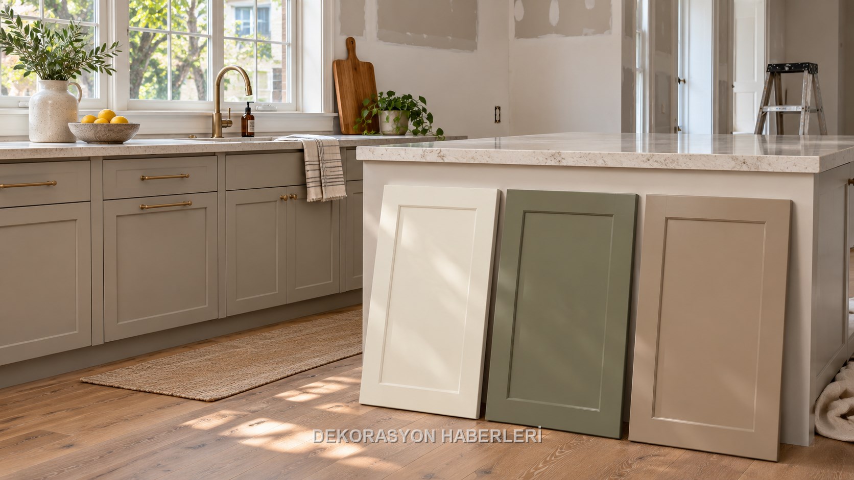
A few centimeters of space on the color chart does not have the same effect as when the entire kitchen is covered. Request at least a cover-sized painted panel or actual cover sample. View the sample separately at the lower and upper cabinet level, next to the window and in the shade.
Leave the panel in the room for a few days. Note how the tone changes with morning light, evening artificial lighting, and overcast weather. The color is also visible when looking at the kitchen from another room; Check if it creates unexpected clashes with living room textiles and wall paint in an open-plan home.
“The right cabinet color is not the one that looks the best on the chart, but the one that connects the counter and the floor in the changing light of the kitchen.”
Remember that white and gray also have undertones
White cabinetry is not without risks; It may have a pink, green, blue or yellow undertone. Very shiny pure white cream countertop is old; Warm off-white can make a cold gray floor look lifeless. Establishing a distinct but deliberate difference between two neutrals produces cleaner results than two nearly matching tones.
Gray color can also shift to blue, green or purple in daylight. In a dim north-facing kitchen, the dark cold gray can become heavy; The same tone appears lighter in strong sun. The orientation of the room alone does not decide, but it does tell you at what times you should specifically monitor the sample.
Maintain proportion when dividing lower and upper cabinets into two colors
Dark lower and light upper cabinets can add weight to the floor and refresh the eye level. However, in a very small kitchen, if there are too many horizontal lines with the counter, handles and walls, the space may be fragmented. Keeping the color transition at an architectural boundary, such as countertop line, looks neater.
Determine from the beginning which color you will add to the tall cabinet or refrigerator surround. A random single dark cover can be perceived as a mistake; The conscious block establishes order. If you are using two colors, avoid unnecessary proliferation of the palette by reducing the number of materials and handles.
Take surface gloss as seriously as color
The same color looks different on matte, satin and glossy surfaces. The glossy cover reflects light, making the space look lively, but it highlights fingerprints and wavy surfaces. A very matte dark surface may show some touch marks; Test the cleanability data and real sample of the product.
Touch the sample with clean fingers, leaving small traces of water and oil, and wipe with the recommended method. Daily maintenance that requires abrasive sponges or strong chemicals is not sustainable. Also examine the detail sample, as the edge band, handle surround and cover combination may wear out before the surface.
Do not consider the handle and metal tone as accessories added later.
Even though the handle looks small because it is repeated on all covers, it creates a strong rhythm. High contrast on the black handle open lid, brushed metal can create a calmer line. It is not necessary to match the faucet, device and lighting metal exactly; but keep tones limited and deliberate.
In handleless systems, profile color and shadow space are part of the palette. See the dirt and wear behavior of the frequently handled edge. Experiment with how the large handle transfers the pulling force to the cover and whether it creates problems with sharp edges or snagging on clothing.
Close the order with code, surface and sample approval
Color names vary from brand to brand; Writing “off-white” is not enough. Manufacturer code, surface type, cover material, edge finish and approved physical sample must be recorded in the order. Ask the supplier about the possibility of shade variations in different production batches.
Check the covers in daylight before installation; Report obvious tonal differences, scratches and edge defects without getting stuck. The good look of the result comes not from a single bold color, but from the consistent repetition of a light-tested palette across countertops, floors and hardware.
Related guides: using wood tones together
A decision guide that tests the color at home with a large sample, undertone, surface gloss and care behavior, instead of choosing the color from the color chart alone.
Decision table
Application checklist
- ✓First determine the surfaces that will not change
- ✓Use large moving sample instead of small card
- ✓Remember that white and gray also have undertones
- ✓Maintain proportion when dividing lower and upper cabinets into two colors
- ✓Take surface gloss as seriously as color
Most common mistake
Even though the handle looks small because it is repeated on all covers, it creates a strong rhythm. High contrast on the black handle open lid, brushed metal can create a calmer line. It is not necessary to match the faucet, device and lighting metal exactly; but keep tones limited and deliberate. In handleless systems, profile color and shadow space are…
Care note
Color names vary from brand to brand; Writing “off-white” is not enough. Manufacturer code, surface type, cover material, edge finish and approved physical sample must be recorded in the order. Ask the supplier about the possibility of shade variations in different production batches. Check the covers in daylight before installation; Report obvious tonal…
Frequently asked questions
What should be decided first for How to choose kitchen-cabinet color with light, worktop and floor?+
If floor, countertop and wall ceramics will remain, the cabinet color should relate to these three large surfaces. Observe the warm, cool or neutral undertone of each in the same daylight. Placing a bluish white next to a stone with a yellow undertone can make both surfaces look dirty. Do not match ingredients from…
What should be checked before measuring and installation?+
A few centimeters of space on the color chart does not have the same effect as when the entire kitchen is covered. Request at least a cover-sized painted panel or actual cover sample. View the sample separately at the lower and upper cabinet level, next to the window and in the shade. Leave the panel in the room for a…
Which criteria matter when choosing materials?+
White cabinetry is not without risks; It may have a pink, green, blue or yellow undertone. Very shiny pure white cream countertop is old; Warm off-white can make a cold gray floor look lifeless. Establishing a distinct but deliberate difference between two neutrals produces cleaner results than two nearly matching…
How should the maintenance plan be organised?+
Color names vary from brand to brand; Writing “off-white” is not enough. Manufacturer code, surface type, cover material, edge finish and approved physical sample must be recorded in the order. Ask the supplier about the possibility of shade variations in different production batches. Check the covers in daylight…